Case Study
4 min. read
Site Search

SearchStax Site Search solution gives marketers the agility they need to optimize website outcomes.
Product Overview
SearchStax Managed Search offloads Solr management, giving IT teams enhanced operational agility.
Product Overview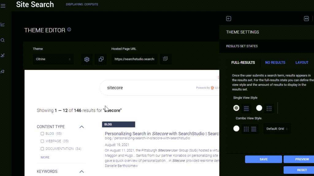
September 07, 2021
Rahul Thapar
|
SearchStax recently released the Theme Editor feature for SearchStax Studio which offers out-of-the box themes that can be applied to your site search application. What if you already have a theme in mind and want to edit the page yourself with minimal effort? You can also use the Theme Editor to quickly create your own theme using one of included out-of-the-box themes as a starting point.
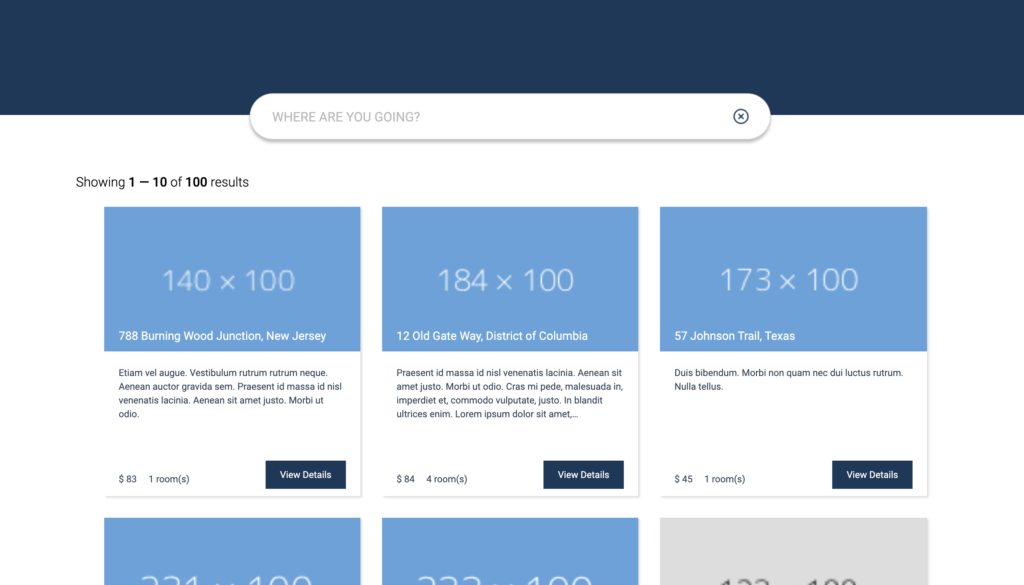
The following post is a detailed walkthrough on how you can create your own search page theme using the Citrine default theme as a base.
(NOTE: This post is written by a developer and is targeted at developers who are very familiar with CSS and HTML. The post assumes that the reader has the SearchStax Studio App installed and connected to a data source).
Here is my installed SearchStax Studio App with data already indexed, consisting of the following fields:
Following is the Citrine theme applied by SearchStax Studio as default theme on our application when we view the Hosted Search App page.
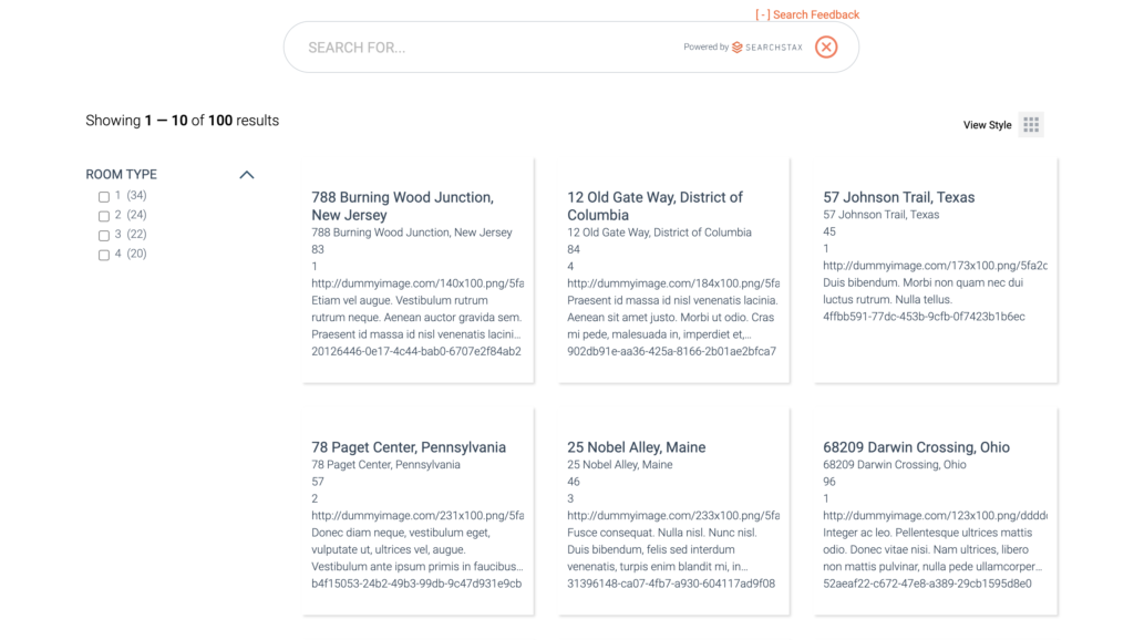
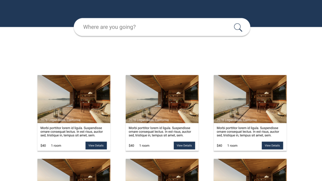
We will be using the Theme Editor to customize the search page.
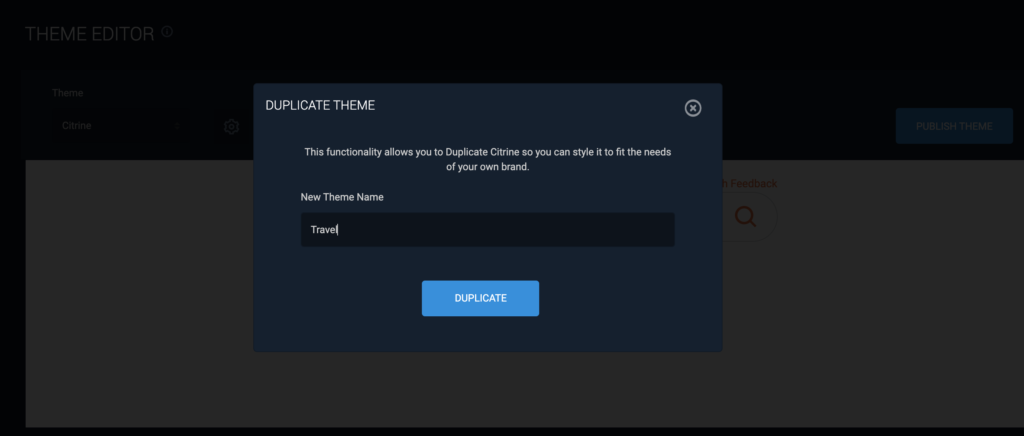
First, make a copy of the Citrine theme.
This step is crucial because we want to keep our theme separate and apply it as per our convenience. I will name my theme “Travel” and click on Duplicate to replicate the base theme.
Make a checklist of the differences between our theme and the Citrine theme.
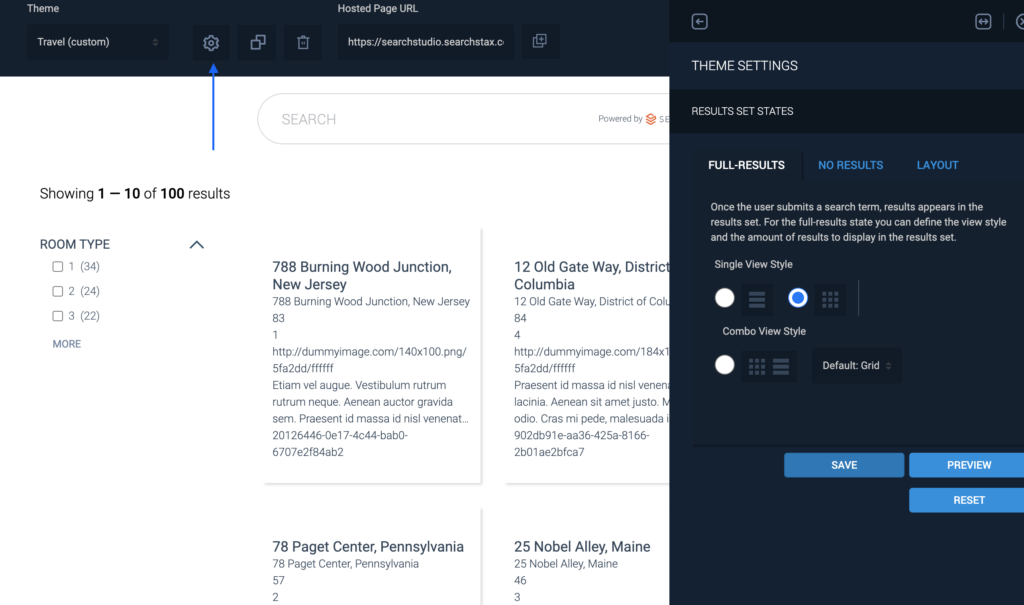
Click on the Settings icon. It will open Theme Settings Tab. From the View Style tab, select the Single View Style option. We just need the grid view, so we select the grid option and click Save to update the changes to our theme.
If you want to see the changes just click on the Search icon in the input box and you will only see the grid option and the toggle switch will no longer be there.
If you want to see the changes on the actual page, click on Publish button and it will give you a link to the Hosted Page App where you can see all the changes you make during this post.
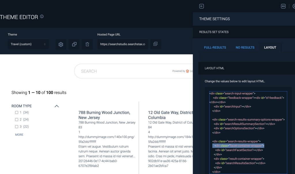
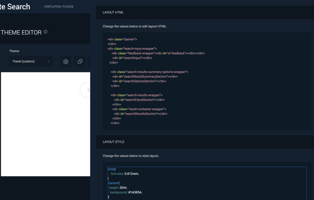
<!-- Add this above the
search-input-wrappr div -->

<div class="banner">
</div>
//Add this to the CSS
.banner{
  height: 20vh;
   background: #1A385A;
}
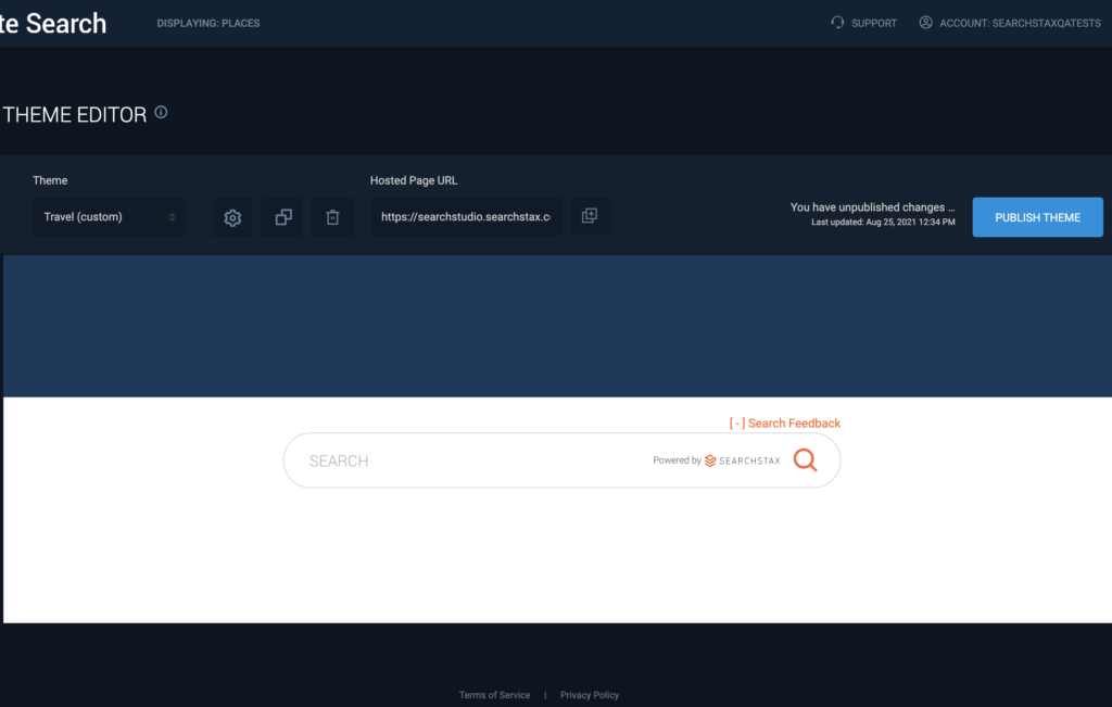
We can see the banner once we click “Save”.
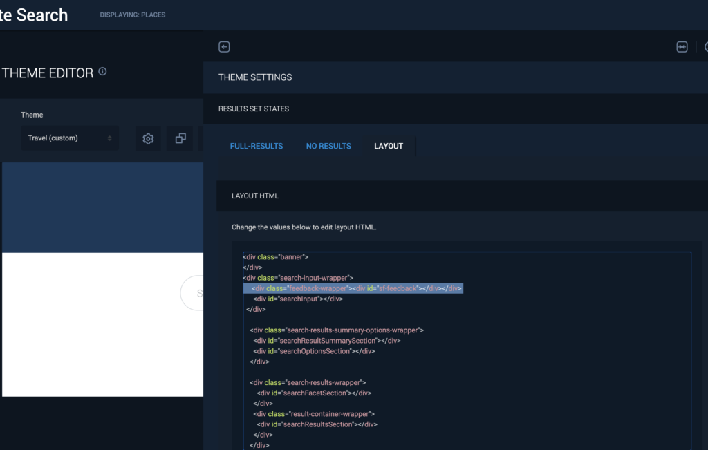
Now, let’s move the Search box above and style it to look like our design.
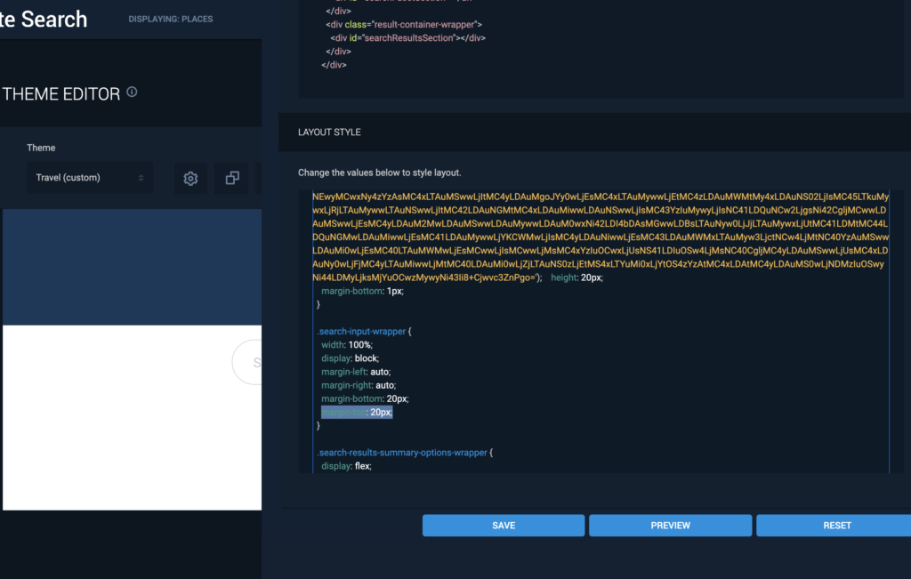
Search box has a class search-input-wrapper. Once we look that class up in the CSS tab, we can change the margin-top property from 20px to -30px to move it up in the y-direction.
One of the most useful feature of the Theme Editor is that if we want to edit a component we can simply hover over that component and click on the Edit button to style it.
To style the search box, hover on it and click the Edit button. This will open up the corresponding search nox HTML and CSS tab to the right.
This section shows how to change the placeholder text and how to remove the background images from the search box. The HTML sections have distinct identifiers that match the CSS classes to make editing easy.

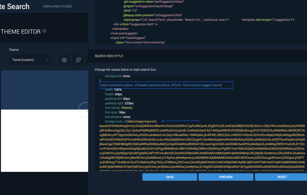

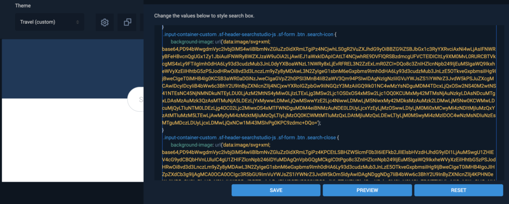
Note: The background images are base64 encoded. If you want to replace the icons with your only icons, you can convert your images to base64 and place it in the CSS as shown below. Here is a useful link that can help convert images to base64: https://www.base64-image.de/
Hover over the result section and click the edit button to view the RESULT ITEMS HTML and RESULT ITEMS STYLE.
In order to edit the result section we first need to understand the bindings so that we can map the data to our design. Refer to the fields described above in this post. These fields are returned by the SearchStax Search API and we can access them using the result keyword. So, if we want to access the title we can simply get the value by doing: result.title, for description: result.description, for image: result.image, so on and so forth.
Now, if we look at the default card bindings we actually do not need all the code and can simply use the above method to use what we require. So first, remove all the marked Vue bindings.
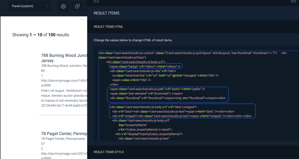
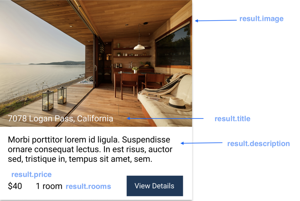
So, we can edit the HTML as follows:
<div class="card-searchstaxstudio-js-custom" :class="{'card-searchstaxstudio-js-grid-layout': isGridLayout, 'has-thumbnail': thumbnail !== ''}">
<div class="result-header">
<img class="result-image" :src="result.image" alt="place">
<div class="card-searchstaxstudio-js-title bottom-left" v-if="title">
<a class="stretched-link" v-if="url" :href="url" @click="navigate" v-html="title" />
<span class="result-title" v-else v-html="title" />
</div>
</div>
<div class="card-searchstaxstudio-jsClass">
<div class="card-searchstaxstudio-js-body p-0 result-info">
<div class="card-searchstaxstudio-js-body p-0">
<div>
<p class="truncate"> {{ result.description }} </p>
<p class="bottom-left"> <span> $ {{ result.price }} </span> <span> {{ result.rooms}} room(s) </span> </p>
<button class="result-btn">View Details</button>
</div>
</div>
</div>
</div>
</div>
					.result-image{
  width: 100%;
  height: 200px;
  object-fit: cover;
}
.result-info{
  padding: 20px !important;
}
.result-title{
  font-size: 16px;
  font-weight: 400;
}
.result-header{
  position: relative;
  text-align: center;
  color: white;
}
.bottom-left{
  position: absolute;
  bottom: 0px;
  left: 20px;
}
.truncate{
    overflow: hidden;
    line-height: 1.2rem;
    max-height: 8rem;
    -webkit-box-orient: vertical;
    display: block;
    display: -webkit-box;
    overflow: hidden !important;
    text-overflow: ellipsis;
    -webkit-line-clamp: 4;
}
.result-btn{
  padding: 12px 20px;
    position: absolute;
    right: 20px;
    bottom: 10px;
    border: none;
    cursor: pointer;
    background: #1A385A;
    color: #fff;
}
.card-searchstaxstudio-js-custom {
	 position: relative;
	 //padding: 39px 12px 28px 12px;
	 color: #33475a;
	 border: none;
	 box-shadow: 2px 2px 3px rgba(0, 0, 0, 0.14902);
}
Once all the changes have been made, click PUBLISH to get the link to the Hosted Search Page. We can see that the theme we created is now applied to our SearchStax Studio App.
