Theme Editor Walk-through Example
Theme Editor is deprecated!
Theme Editor will no longer be supported after November 30, 2023. We encourage you to view our other Search UI options.
The SearchStax Site Search solution offers out-of-the box themes that can be applied to your Search App. But what if you already have a theme in mind and want to edit the page yourself with minimal effort? This is now possible with the Theme Editor.
The following post is a walk-through on how you can create your own theme using the default Citrine theme as a base.
(This post assumes that you have already have a Search App up and running.)
What are we making?
We have a Search App ready with data already indexed. The data consists of the following fields:
- id
- street_address
- zip_code
- state
- title
- rooms
- image
- description
This is the Citrine theme applied by Site Search as default on our application when we view the Hosted Search App page.
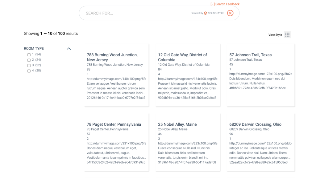
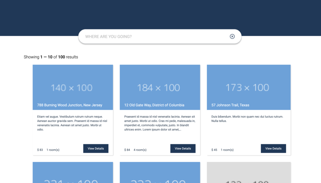
We propose to add some spice to the above theme to make it look like:
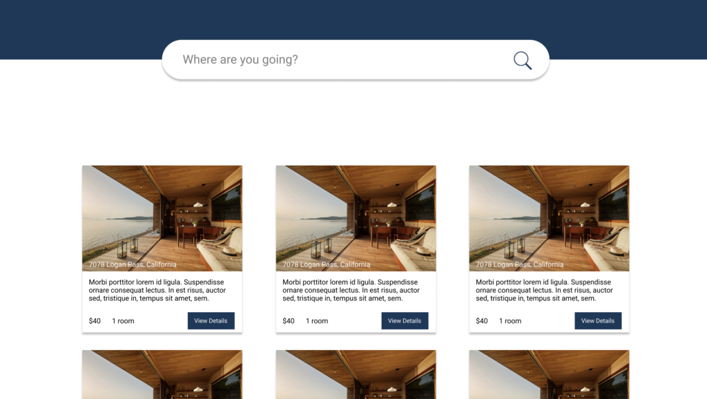
We will be using the Theme Editor provided by SearchStax.
How to Customize the Base Theme?
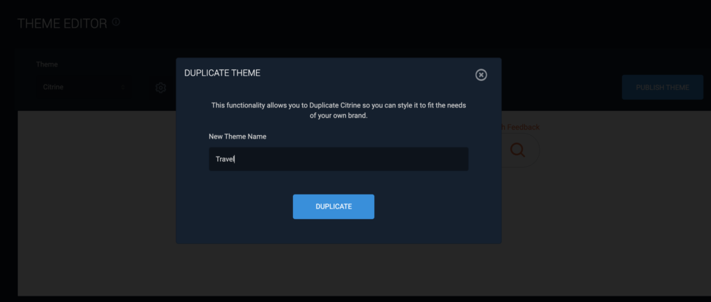
First, make a Copy of Citrine. We’ll make our changes in the copy.
This step is crucial because the default themes in the Site Search are protected and cannot be changed. We will name our theme “Travel” and click on Duplicate to replicate the base theme.
Make a checklist of the differences between our theme and the Citrine theme:
- Citrine has a toggle button to switch between grid view and list view, but our theme only has a grid view. So, remove the toggle button.
- Our theme has an additional banner at the top. Add the banner.
- Customize the search box to make it look like our design by changing the icons.
- Our theme doesn’t use faceted search. Remove Facets.
- Give a new look to the result cards and display only the information we need.
Click on the Settings icon (![]() ). It will open the Theme Settings Editor. Click Full Results. Look for the Single View Stule “Grid” option and select it. Click Save to update the changes to our theme.
). It will open the Theme Settings Editor. Click Full Results. Look for the Single View Stule “Grid” option and select it. Click Save to update the changes to our theme.
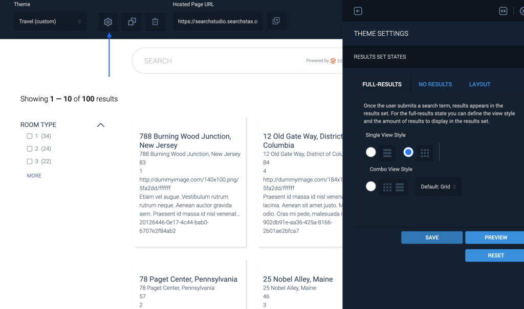
If you want to see the changes just click on the Search icon in the input box and you will only see the grid option. The toggle switch (List vs Grid) will no longer be there.
If you want to see the changes on the actual page, click on Publish button and it will give you a link to the Hosted Page App where you can see all the changes you make during this post. (Note that a Search App may have only one published theme at a time.)
To remove the Facets, click on the Layout tab. This opens the HTML and CSS code for the page layout. Here we can see that the page is divided into different sections. Each section in the Layout tab is a wrapper around the text you see on the result page. Since, we do not need the facets for our design we can remove the facet-container-wrapper. Click on Save to see the changes.
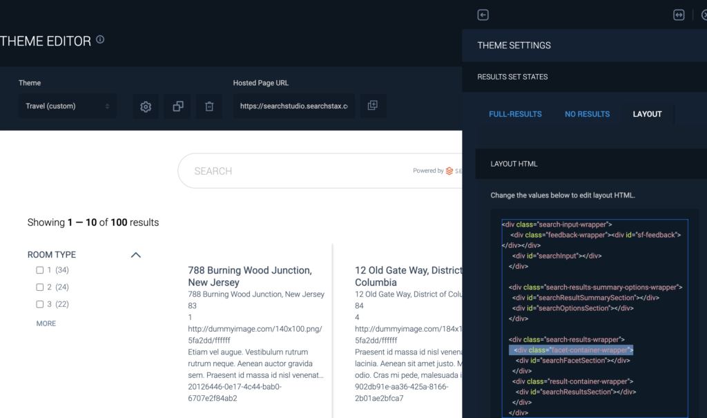
The next change we need to do is to add the banner to our web page. As mentioned above, the Layout tab contains the skeleton of the app. Hence, we can add a div here to add the banner to our application.
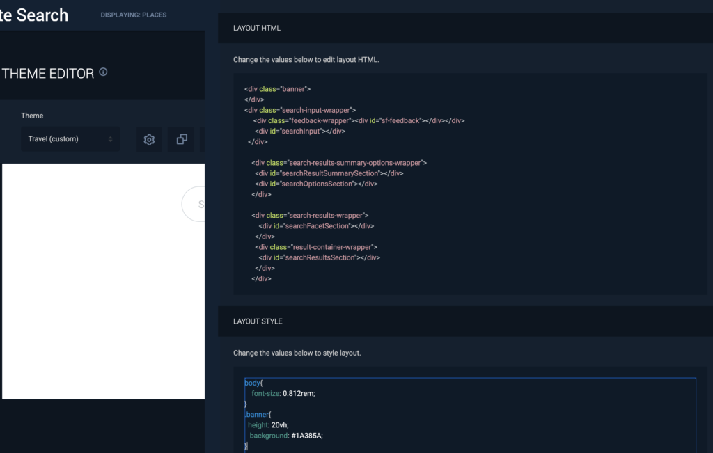
<!-- Add this above the
search-input-wrappr div -->

<div class="banner">
</div>
//Add this to the CSS
.banner{
  height: 20vh;
   background: #1A385A;
}
We can see the banner once we click Save.
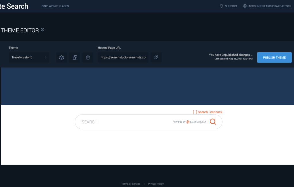
To remove the Feedback button, simply remove the feedback-wrapper div.
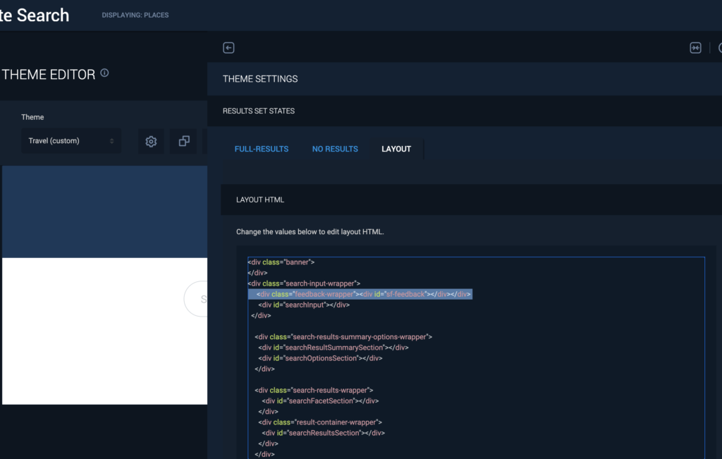
Now, let’s move the Search box above and style it to look like our design.
Search box has a class search-input-wrapper. Once we look that class up in the CSS tab, we can change the margin-top property from 20px to -30px to move it up in the y-direction.
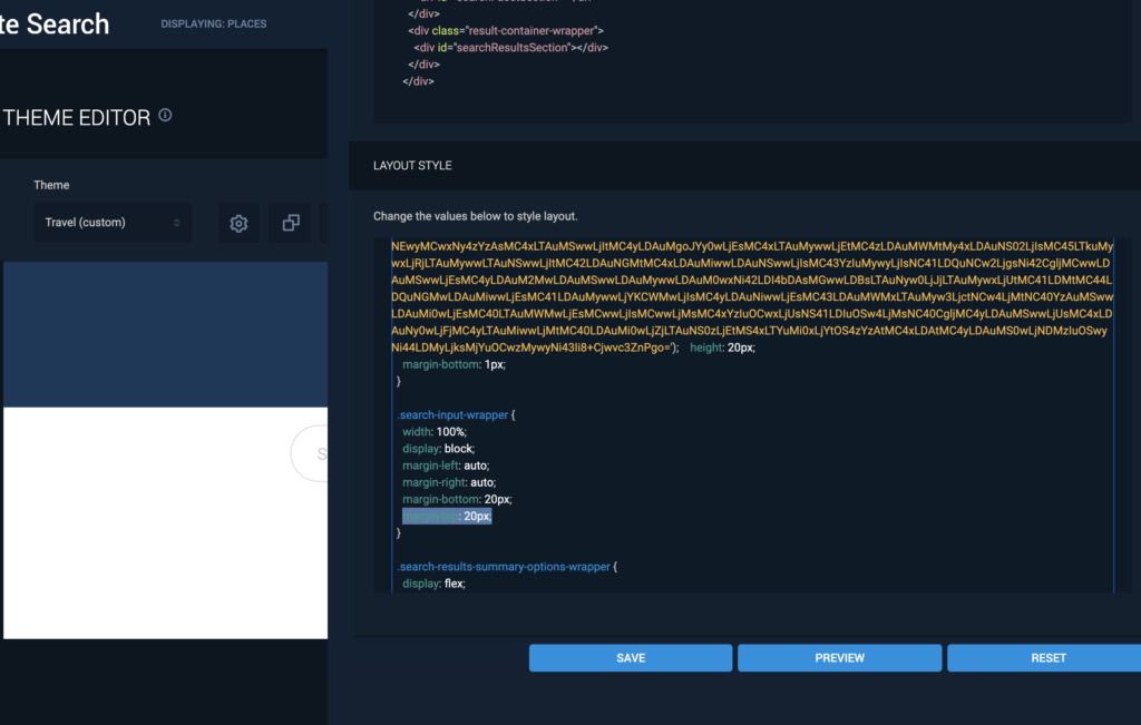
We now have something close to what we want, but we still need to remove the background from the search box.
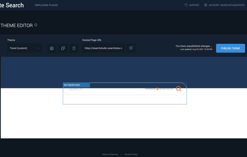
One of the most useful feature of the Theme Editor is that if we want to edit a component we can simply hover over that component and click on the Edit button to style it.
To style the Search box, hover on it and click the Edit button. This will open up the corresponding Search Box HTML and CSS editors to the right.
Edit Search Box
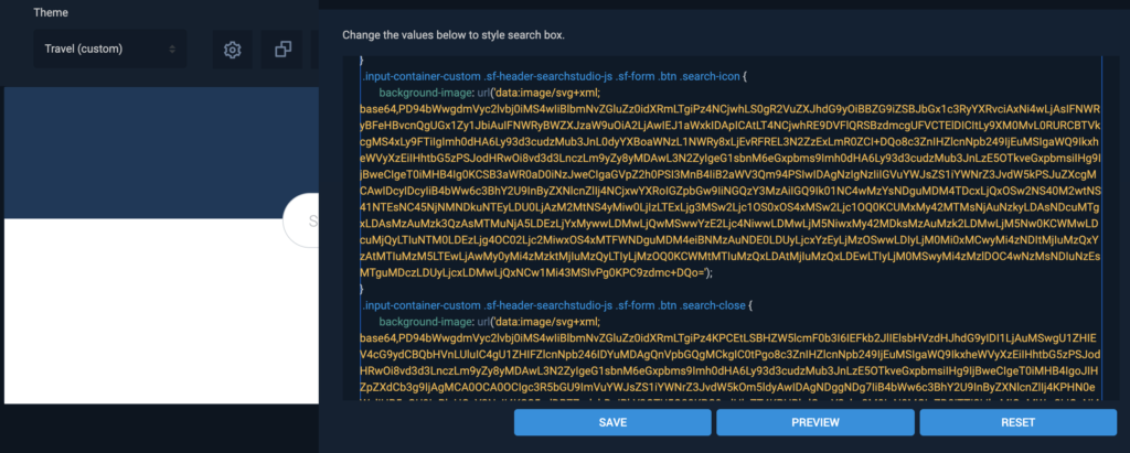
This section shows how to change the placeholder text and how to remove the background images from the Search box. The HTML sections have distinct identifiers that match the CSS classes to make editing easy.
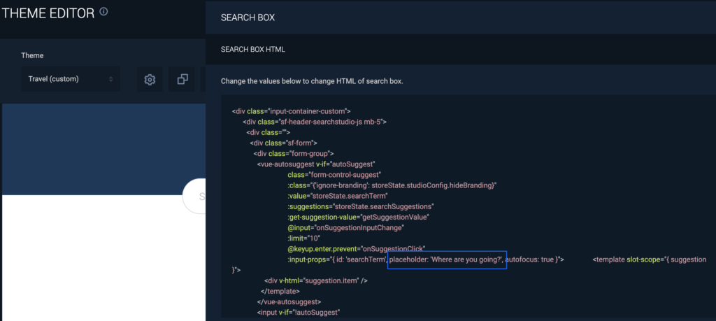
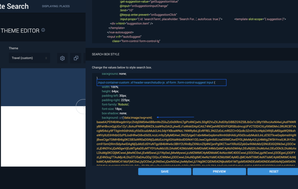
Once we make the above changes, we now have a page that looks close enough to our design.

Note: The background images are base64 encoded. If you want to replace the icons with your own icons, you can convert your images to base64 and place it in the CSS as shown below. Here is a useful link that can help convert images to base64: https://www.base64-image.de/
Edit Search Result Cards
Hover over the result section and click the edit button to view the Result Itmes HTML and Result Items Style editors.
In order to edit the result section we first need to understand the bindings so that we can map the data to our design. Refer to the fields described above in this post. These fields are returned by the SearchStax Search API and we can access them using the result keyword. So, if we want to access the title we can simply get the value by doing: result.title, for description: result.description, for image: result.image, and so on.
Now, if we look at the default card bindings we actually do not need all the code and can simply use the above method to use what we require. So first, remove all the marked Vue bindings.
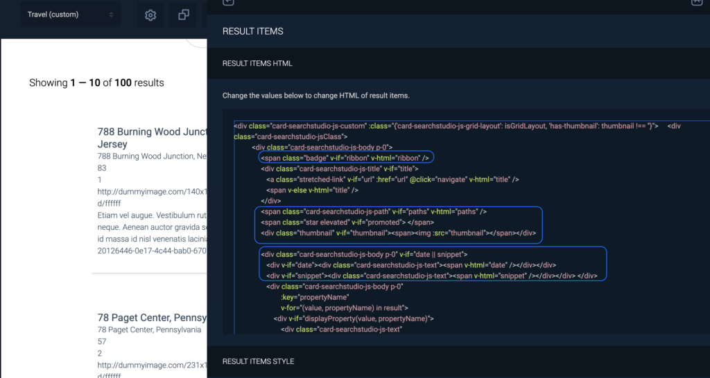
Our card can be analyzed into the following result components:
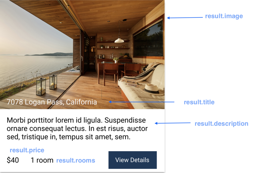
So, we can edit the HTML as follows:
<div class="card-searchstudio-js-custom" :class="{'card-searchstudio-js-grid-layout': isGridLayout, 'has-thumbnail': thumbnail !== ''}">
<div class="result-header">
<img class="result-image" :src="result.image" alt="place">
<div class="card-searchstudio-js-title bottom-left" v-if="title">
<a class="stretched-link" v-if="url" :href="url" @click="navigate" v-html="title" />
<span class="result-title" v-else v-html="title" />
</div>
</div>
<div class="card-searchstudio-jsClass">
<div class="card-searchstudio-js-body p-0 result-info">
<div class="card-searchstudio-js-body p-0">
<div>
<p class="truncate"> {{ result.description }} </p>
<p class="bottom-left"> <span> $ {{ result.price }} </span> <span> {{ result.rooms}} room(s) </span> </p>
<button class="result-btn">View Details</button>
</div>
</div>
</div>
</div>
</div>
The corresponding CSS changes:
.result-image{
  width: 100%;
  height: 200px;
  object-fit: cover;
}
.result-info{
  padding: 20px !important;
}
.result-title{
  font-size: 16px;
  font-weight: 400;
}
.result-header{
  position: relative;
  text-align: center;
  color: white;
}
.bottom-left{
  position: absolute;
  bottom: 0px;
  left: 20px;
}
.truncate{
    overflow: hidden;
    line-height: 1.2rem;
    max-height: 8rem;
    -webkit-box-orient: vertical;
    display: block;
    display: -webkit-box;
    overflow: hidden !important;
    text-overflow: ellipsis;
    -webkit-line-clamp: 4;
}
.result-btn{
  padding: 12px 20px;
    position: absolute;
    right: 20px;
    bottom: 10px;
    border: none;
    cursor: pointer;
    background: #1A385A;
    color: #fff;
}
.card-searchstudio-js-custom {
	 position: relative;
	 //padding: 39px 12px 28px 12px;
	 color: #33475a;
	 border: none;
	 box-shadow: 2px 2px 3px rgba(0, 0, 0, 0.14902);
}
Final Result
Once all the changes have been made, click Save and Publish to get the link to the Hosted Search Page. We can see that the theme we created is now applied to our Search App.
Questions?
Do not hesitate to contact the SearchStax Support Desk.

